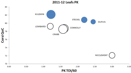
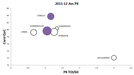
Rob Vollman's bubble chart for player usage (.pdf) is all the rage in the statosphere right now; he uses it to show players zone starts, quality of competition and their corsi rels all in one image. It's a really invaluable resource but I felt like it wasn't great for penalty kills because you'd guess most of them happen in the defensive zone.
That said I wasn't sure what to put on the X axis, so I replaced zone starts with PK time on ice per 60 minutes to see who was playing the PK more than others. The size of the bubble is Corsi Rel. Big blue bubble = good, big white bubble = bad.
Thoughts? There are some things I don't like and some things that might let us come to a better conclusion here. First off is that the bubble size is tied to Corsi Rel, and across two different teams I don't know how I feel about that.
Where do you guys weigh in on this? How would you interpret this data? What would you need to see to make a judgement call on McClement's PK ability?


Comment Markdown
Inline Styles
Bold: **Text**
Italics: *Text*
Both: ***Text***
Strikethrough: ~~Text~~
Code: `Text` used as sarcasm font at PPP
Spoiler: !!Text!!